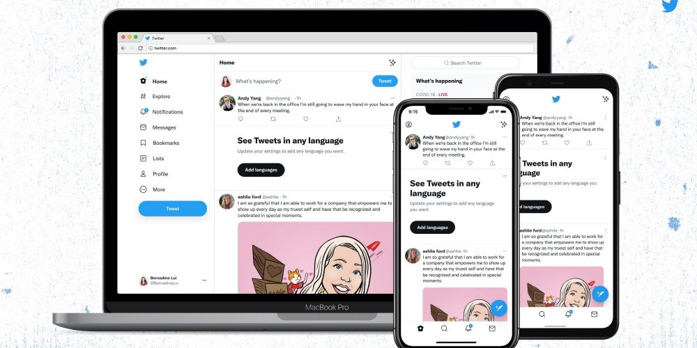
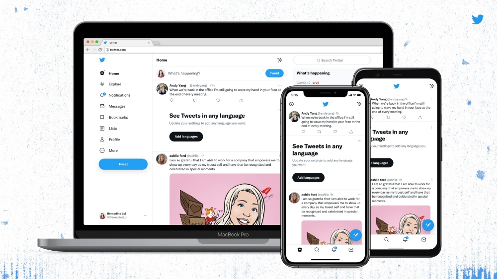
On August 12 (local time), Twitter changed the Twitter client UI for both the web version and the mobile version. The update says it will be easy to use, unique, and focussed on the conversation.
The big change in appearance is the button display. Until now, the following button was displayed with white text on a blue background, but after the update, the white background and follow button on a black background changed to white text. The purpose is to significantly reduce the blue color to enhance the contrast and make the photo or video stand out.
However, since the existing Follow button had a white background, the meaning of the button display was reversed. So there is a lot of opinion on Twitter that mistakes can happen. Twitter also said that it may feel a bit uncomfortable at first with this opinion. There are also opinions that it is difficult to see in dark mode, but Twitter is expected to gradually solve this problem by introducing a new color palette soon.
Other changes include adopting the font chirp announced in January so that the text is left-aligned and can be easily viewed by scrolling. However, the font is not changed except in English. Related information can be found here.


Add comment