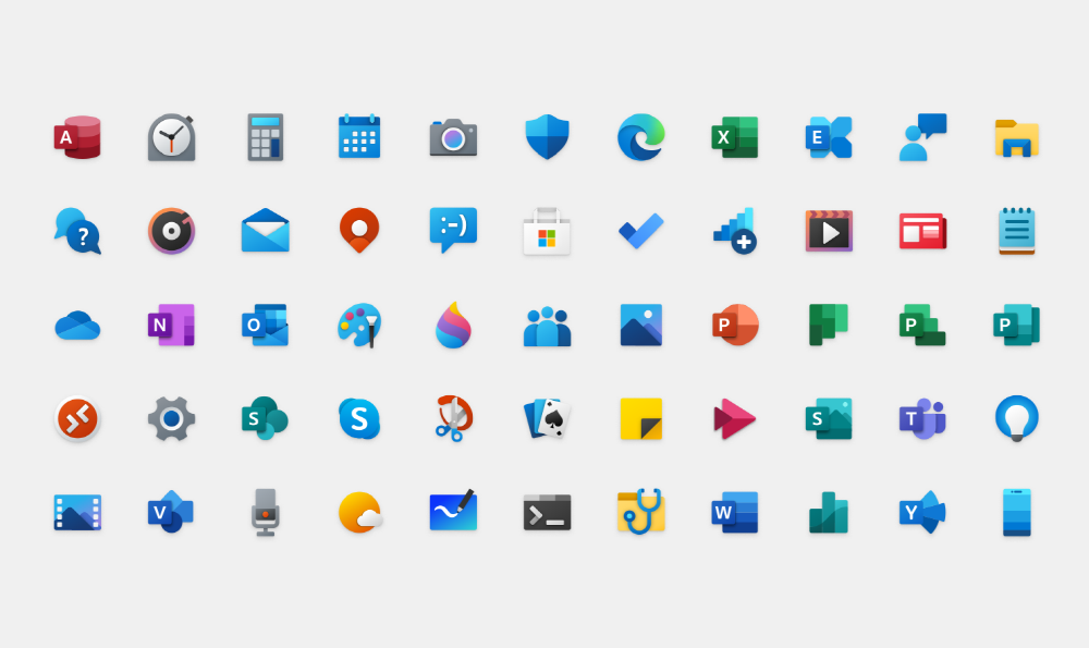
Microsoft has renewed the design of icons for various application programs used in operating systems such as Windows 10. The new icon with a colorful and simple design is a compilation of Fluent Design, which Microsoft has devoted to development since three years ago.
The first time Microsoft unveiled the existence of Fluent Design was at Microsoft Build 2017, a developer event in 2017. Since then, Microsoft has changed the office icon and changed the icon design step by step through the Windows 10X UI, which is an operating system for dual display terminals.
In the midst of this, Christina Kane, who leads Microsoft’s design, has unveiled a new icon for Windows 10 using Fluent Design. It can be seen that the design of the mail client icon has evolved as the times have passed. In addition, if you look at the change of the calculator icon from the black and white design used around 2012 to the fluent design, you can see that the colorful and original design is changing.
In response to these changes, Kane said that he introduced depth and color to the icons through the fluent design. These changes are delicate, but they make a big difference in the visual impression when viewed. It is explained that it gave a familiar and friendly image by providing a consistent design language through various devices and platforms by adding rounded corners and colors.

In addition to being able to see the new design icon as an app icon provided in the Microsoft Store, Windows Insider members who can quickly experience the new features of Windows will already be provided with a new mail client and calendar icon. Over the next few months, the icons of Windows Insider users will change little by little.
Kane said that the new design is in mind to create familiar, beautiful and comprehensive icons in a new user experience regardless of cross-platform devices such as Android, iOS, and Mac as well as Windows. Ultimately, not only Windows users, but also Android and iPhone users everywhere. You’ll see Microsoft’s new icon on the screen. Related information can be found here .


Add comment