
For a startup to succeed in business, how it can appeal to investors and venture capitalists and attract funds is the key. Y Combinator draws attention by commenting on the points for an outstanding presentation of a startup.
Y Combinator is dealing with a program called Series A, which aims to support the Series A round, which first raises funds from investment institutions. Series A program manager Janelle Tam said that after teaching entrepreneurs how to make hundreds of hours of presentation material, she realized that she was repeating the same advice. I am introducing.
According to this, when creating presentation materials, it is first necessary to clarify why on earth you will be invested. He picks six things that are necessary to shape the direction of the presentation.
The first is that the other party is an investor, not a customer. The Series A presentation is for investors and should not be mistaken for a presentation for customers. For investors, it may not be intuitively understood how a business that has no experience with the problem of a startup trying to bring a solution can solve the problem. Therefore, he says the presentation needs to contain two perspectives: the challenges facing the target audience and how their services will solve them.
The second is to organize your presentation clearly and concisely. Make the data easy to understand so that investors can understand the business in a short time. He says the best presentation is to avoid terms with simple words, but advises that if a term is needed, first define its meaning concisely.
The third is to summarize. The presentation is not meant to make the business content understandable to all investors, it is important to attract investors. Therefore, it is said that 15-20 minutes of presentation and 40-45 minutes of Q&A are good for allocating time.
Next, let’s start with the results. Unlike the seed round before the founding, where only promises were sufficient, the Series A round is harsh. It is pointed out that start-ups that have already started their business require performance, so start with what they did.
Next, ask where you are going. After showing performance, it is necessary to show investors a blueprint of where the business is heading in the future. Venture capital investments have to make investors think that this is possible because they expect tremendous returns.
The next thing is to make you think that financing is the last gateway. In the presentation, it is necessary to clarify that what the company lacks is lack of funds and is hindering the growth of startups. I advise you to get this into your presentation material and to show you how to use the funds to reach the next level.
◇ The slide structure is 10 to 15 pages = The slides to be used in the Series A presentation are usually between 10 and 15 pages, excluding the attached materials. If the Y Combinator is a start-up giving a Series A presentation, the example explains a slide example that succeeds in financing.
First, the title is on page 1, and the logo is largely placed in the center, and a brief description of the project to support Series A funding is written below.
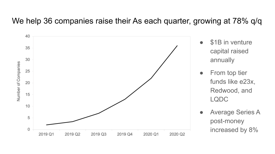
The second is page 1, which shows a concisely organized graph of the data used in the presentation as an element to attract investors’ attention. We are supporting 36 company Series A quarterly, and a caption is attached that it has increased by 78% compared to the previous quarter.
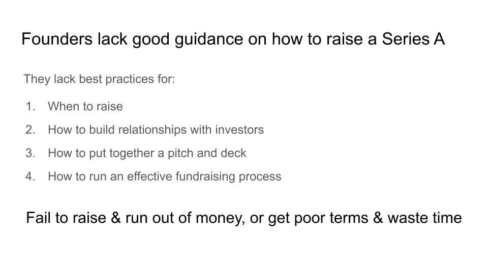
Next also raised a one-page question. Present the challenges that the business aims to solve. In the case of the Y Combinator, entrepreneurs lack good guidance on how to finance Series A. Specifically, there is a lack of procurement timing, ways to build relationships with investors, how to make presentations and materials, and how to effectively implement the financing process.
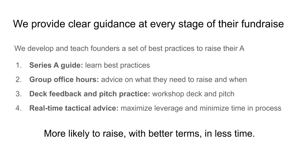
Fourth is a one-page solution. Write down how to solve the previously identified task. In the case of Y Combinator, it provides step-by-step instructions for raising corporate funds. Specifically, it creates a Series A best practice guide, advises when and how it needs to be finished, holds workshops for presentations and slides, and reveals advice to maximize utilization and minimize the time it takes for the process.
Next, we delve into the details of the content on page 2 over a few pages.
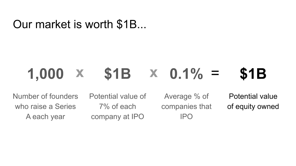
Then, a one-page market research. It provides a numerical overview of the startup’s impact on the industry and its value in the market.
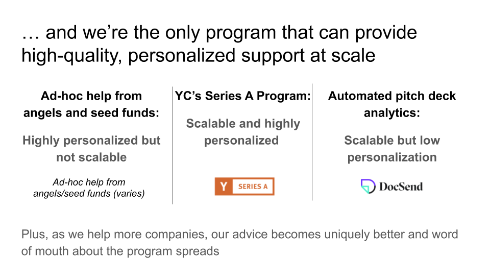
Next is a one-page competitor. Choose a service that precedes competitors and appeals their strengths to them.
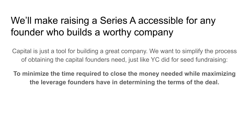
The eighth is the vision. Here, we show what kind of vision the startups are offering. In the case of Y Combinator, it means that all companies will succeed in financing in Series A by nurturing valuable companies.
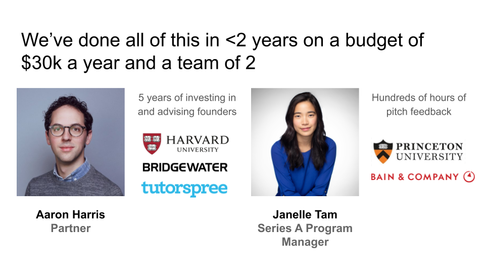
Next is a one-page team introduction. Introducing the key members of the startup.
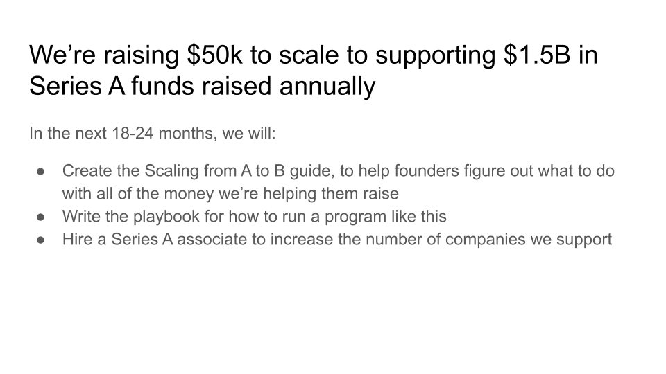
The last tenth is page 1 for use of funds. If the funds are raised safely, specify how they will be used. Here, the 11th question-and-answer appendix can be added. It is a good idea to put in material that will be available later in the Q&A session. Examples include a list of frequently asked questions, answers to questions, and slides if you need visual information. In addition, data that predict future financial conditions and data that explain the use of the above funds in more detail are also effective.
It is said that Q&A is the culmination of the presentation, and all slide materials are made for this time. However, it is true that some startups often give presentations without Q&A, so it is advised to put in Q&A time.
◇ When creating materials, what are the design considerations? = Materials should focus on ease of understanding rather than beauty. In many cases, in experience, it is important to note that making simple and simple materials as much as possible and slides should be easy to understand. He points out that this is NG, saying that colorful and complex pictures or appearances are good, but colorful images that do not describe anything are often used.
It also explains the points to be noted when giving video presentations. Recently, rather than inviting investors to present presentations, presentations are often made online. What are some things to watch out for when giving a presentation with online video conferencing tools such as zoom?
First, look at the camera, not the PC screen. Ring light often used by TikTok users is useful in some cases. Also, make sure to set the audio settings appropriately. This includes providing a quiet environment where you can calmly ask and answer questions.
In principle, one person speaks. Switching microphones can cause trouble, so it’s safe to have one speaker.
It is also important to record. It’s also helpful to see later and look back at your presentation. It is said that more often than not, it is a conversation without ambition.
Next, prepare a script. Also, when you do not have to say long phrases at once, it is effective to put the corresponding lines in the sentences in advance so that they are not blocked or solved in the middle. Related information can be found here.


Add comment