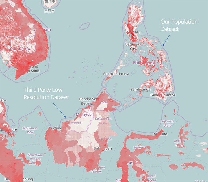
The maps developed by Facebook in collaboration with Columbia University’s International Earth Science Information Network Center CIESIN use artificial intelligence. By applying machine learning to population data and satellite imagery, it is possible to calculate mapping and population distribution in a complicated structure, and it can be used in various ways.
If you have a disaster or an epidemic, you should use mapping tools to know exactly where to help. However, it is not easy to use accurate maps with high reliability. The Facebook project first mapped to maps and satellite imagery for 22 countries in Africa. Of course, the project will later map the world population.
It is possible to accurately identify the structure of a specific area and the population distribution it is taking, so that if a disaster occurs, the evacuation can be carried out accurately or the healthcare worker can appropriately contact the disaster victim or infected person.
In fact, in Malawi, South East Africa, the Red Cross has used the map in conjunction with the Red Cross to carry out measles and rubella vaccination campaigns. The map showed that 97% of the land area was unmanned, so it was able to be deployed smoothly in areas where volunteers were needed. Tanzania, one of only three people who can not use electricity, said that it helped plan the electricity work by identifying where to allocate energy resources through Facebook’s AI map.
Facebook said it believes that accurate data is crucial to humanitarian work, and that mapping projects will help build partnerships with NGOs.
A country-surveyed census indicates a population living in a particular area, but it does not indicate where people live in the area. Therefore, detailed mapping is essential to efficiently allocate resources such as vaccination campaigns.
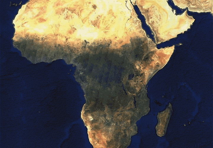
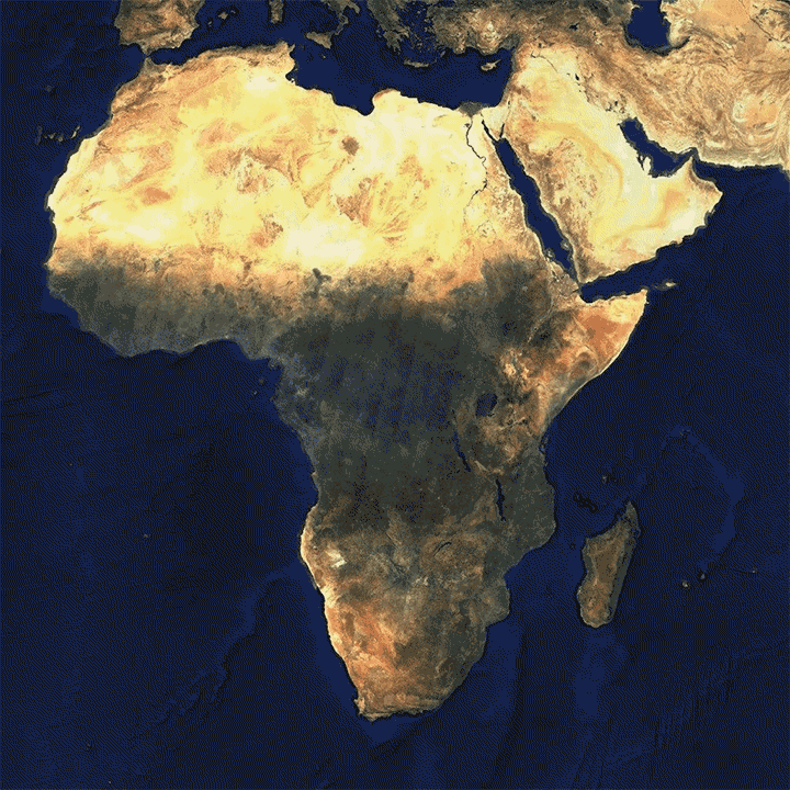
The map with AI predicts whether or not to include the building when loading the satellite image. Then, based on the census data, we calculate how many people are in the building and how many people there are in the area. The image at the top of the article is a sample from Facebook, which evaluates the location of the building throughout Africa, with the top spot marked with a blue dot. If you click on the image, you can see the demographic distribution of the machine running as a GIF animation.
Research data is provided free of charge by Facebook to local volunteer organizations. Facebook does not use its own data, and it does not include personally identifiable information in its population or satellite data. For more information, please click here .


Add comment